

B2B Platform: Win/Loss Report
role: UX designer
TOOL: SKETCH, BALSAMIQ, PHOTOSHOP
DEVICE: DESKTOP
TIMELINE: 3 SPRINTS

Background:
The dashboard reporting is very important for T1 (MediaMath DSP) users, mainly the AdOps team because they are relying on the data day to day to monitor how their campaigns are performing. Win rate is a very useful metric for AdOps who want to monitor their campaign bid opportunities. Win rate can inform the users on whether they need to increase or decrease their bids across a campaign or strategy.
How I started:
I teamed up with the product manager to sit down with 8 users from AdOps team to understand why and how will they use this win/loss report.
What we learned:
AdOps won’t compare the data between campaigns
AdOps only compare the data between strategies under one campaign
There could be 1-100 strategies under a campaign, it really depends on the complexity of the campaign
AdOps want to know all the drops from getting the targeting matches to the final win rate because they want to know where is the biggest drop from and how can they fix it
Goals:
After getting the insights from our users, the product manager and I sat down to discuss the goal of this project.
A report that can help users easily see the drops from getting targeting matches to creative matches and then to the bid rate and finally the win rate
A report that can help users easily compare strategies under one campaign
Problems:
The uncertainty of the strategy numbers under one campaign is very challenging to the design. We need to think of a way that could display both the win rate of each strategy and compare between strategies, plus we need to keep in mind the edge case of having 100 strategies in a campaign.
Finding Inspirations:
Win rate report is something that you can easily find in the finance industry. So I’ve done some research to see what data they are showing and what charts they are using correspondingly.
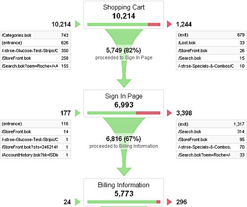
It seems “funnel” is a common way to display win rate, it shows all the drops in the graph and it’s easy for users to see the trend.
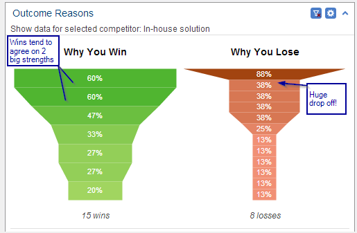
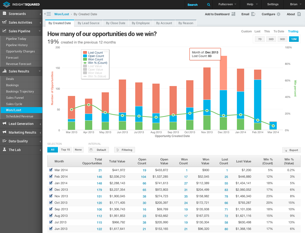
The stacked bar chart is also being used in some win/loss reports. They use different colors to indicate the count for each stage(lost count, open count, won count, win%) and also compare between dates.
Brainstorm & Ideas:
After doing some research on the win/loss report, I’ve listed the pros and cons of each chart. If we are using a funnel, we will be able to display the count for each stage of each strategy and shows the trend of the drops, but we can’t compare the strategies by using a funnel view. If we are using a stacked bar chart, we will be able to display the count for each stage and compare between strategies. But it didn’t show the trend as a funnel does, and it won’t solve the problem if we have 100 strategies.
I started to think if we could combine two charts so that we can see the trend of the drops and compare between strategies.
I hosted a design workshop with the product managers and invited a few designers, and engineers to brainstorm together. We found out that a scatter plot chart is a good way to replace the stacked bar chart because it will accommodate the edge case of having 100 strategies. Combined with a funnel that displays the count for each stage and the trend of the drop. One dot is representing a strategy, once the user clicks on a dot, it will display the funnel of that strategy on the right.


Design Validation:
After coming up with a few variations, we want to sync with our users to see if we are in the right direction. We met with 6 users and here are some findings:
Users think the funnel is very easy to read
Users can’t connect the scatter plot with the funnel at first, but once pointed out, they understood it immediately
Users want to see more accurate data when comparing strategies. The Scatter plot didn’t show the exact number
Synthesis:
After synthesizing the findings, there are two questions that we will need to solve in the design:
How might we guide users to understand the connection between the scatter plot chart and the funnel chart when there is no strategy selected?
How might we display the exact data with the trend of the drops and compare all the strategies?
Iterations:
We had another brain-storm session and we came up with an idea to add a data table next to the scatter plot chart. The users can click on the dot and the strategy will be highlighted in the data table on the right, so that they can have the accurate data of the average bid amount and win rate. If the users want to see the funnel, they can click on the funnel icon above the table to bring out the funnel view. Also, the users can click on each strategy on the data table and the dot will be highlighted on the left chart so that users can quickly see the trend of how this strategy is performing among tons of other strategies.


We had another round of design validation with the users. Here are the takeaways of this iteration:
Users immediately click the strategy on the data table because it is a regular behavior of the platform
Users think the scatter plot chart and strategy data table are a good combination to look at the trend and accurate data together
Users didn’t see the funnel icon until we pointed out
Users like the chart combination because they can see the bid amount and win rate for a strategy, meanwhile they can compare between strategies and see the trend of the drop
I added some tooltips to the final design and it will guide the first time users to understand the interaction.


Result:
This feature is being well received by our users and it becomes the second most used report on T1.