
UX Project: Video Preview Tool
role: ui/ux LEAD designer
Tool: SKETCH, PHOTOSHOP,AXURE
The video preview tool project was a workflow improvement project that I worked in MediaMath. At the time, the redesign of the video preview page was being finalized and the PM was working on preview enhancements to the related section in T1. Early designs were presented during UI planning meeting and challenged, the outcome from this meeting led to further design iteration and research to narrow down the feature requirements and polish up the user interactions.
Video Preview Tool Before Redesign

Design Process Summary
- PM holds a kick off meeting with UI Lead to discuss the business requirements and project goals
- PM and UI Lead brainstorm on different ideas for users to preview a set of videos
- PM presents their early design ideas during the UI planning meeting to get feedback on technical feasibility
- PM regroups with designer(s) to focus on the design problem and sketch out simple concept for designer to prototype
- Designer works on a very lo-fidelity proof of concept
- PM writes up questions for validating proof of concept with users
- PM schedules users for user testing I and secures room for user testing
- PM and designer sync up on designs and questions to finalize prototype for testing
- PM and designer conduct user testing and record audio from their session
- Designer transcribes audio to identify user insights and area which need further design thinking and discussion
- PM and designer run a design session to discuss user researching findings and unresolved design decisions
- Designer works on prototypes for user testing II, PM to write questions, schedules and recruits users for testing
- PM/Design to write up and discuss findings
- PM to present findings during UI planning meeting
- PM to finalize product requirements, upload designs and attends poker planning to triage ticket into a sprint
Design Process Details
Kick-off meeting
PM communicates that the business requirements and project goal brief is a concept preview tool within the video preview tab. Each video preview has a lot of content. It is not ideal to put multiple videos on the same page to preview because the users need to keep scrolling to view other videos.
PM and UI Lead brainstorm on some different ideas to address the business requirement
- Pagination
- Dropdown menu
- Previous/Next
Early design ideas presented during the UI planning meeting to get feedback
- Pagination on the bottom

- Dropdown list

- Previous/Next link under the name

After Presenting this in the UI meeting, some PM brought up that these three ideas are hard for users to preview other videos at the same time. The framework team brought up the idea of Gallery/Thumbnails preview.
- Gallery/Thumbnails view
- Paper Sketch of Prototype from Regroup with PM/designers
- Lo-fidelity Proof of Concept by Designer using Axure

Questions for users to validate lo-fi proof of concept with users from PM
- Your role at MediaMath and how long have you been here?
- How do you currently organize creatives and concepts?
- Are the concepts that you deal with all single types or combination?
- How many creatives do you usually have for one concept?
- How often do you use manage concept tab? Can you describe your experience in the tab for me?
- How often do you use creative preview function?
- Do you usually use single or bulk preview?
- Have you ever randomly look at the creative preview?
- Have you ever send the share links to your clients?
- Where in T1 do you expect to preview creatives?
4 users were invited to a user interview over e-mail to give feedback on the video preview tool. Each user interview was scheduled for 30 minutes each, two users were selected from platform solutions and other two from the ad operations team.
PM and designer sync up on the above questions for users to validate lo-fi proof of concept and below prototype for testing

User Research Findings and Unresolved Design Decisions
Summary:
- 3 out of 4 users prefer the video is not autoplay when click on to the next thumbnail.
- 3 out of 4 users like show/hide thumbnails function. Since we didn’t design the full interaction for this, and users didn’t really play with this function, so we need a further discussion on this.
- 4 out of 4 users think 3PAS no thumbnails preview is not a big problem, but they had few suggestion on the design.
- 4 out of 4 users think “Watched” is nice to have. so we want to discuss more and test on how should we present “Watched” mark in the design.
Further Investigation Design Areas:
1. Expand video interaction
- What is the expanded video size?
- Do users click expand icon first or play button first?
- If they click play button first, will the video expand automatically?
- After video finished playing, does the video come back to the normal size or stay the expanded size?
- Will the thumbnails show while the video is in expanded mode?
2. Hide/Show thumbnails
- When do users need to hide/show thumbnails?
- Do we hide thumbnails automatically when the video plays?
- Do we show thumbnails automatically when the video stop/finish play?
- Do we hide thumbnails if there’s a lot of content in the page?
3. 3PAS Thumbnails
- What do you this is? (point the thumbnail and ask users)
- Do you think we should add a title on it?
4. “Watched” mark
- Should we maintain the hover status to show watched?
- How should we present this?
- Should we make the thumbnails grey out and marked as watched after they watch it?
- Should we have a bookmark thing/Flag to represent it is watched?
Research Findings Presented to Creative Tribe PMs with Workshop to Discuss Questions and Next Steps

After the ui lead presented the researching findings, we broke the teams into two group - each PM pairing up with a designer. Team 1 reviewed the unresolved design areas for the expanding video unit and 3PAS thumbnails status while Team 1 discussed and reviewed the hide/show thumbnails and "watched" mark. Each team was asked to think about how to phrase each into a question for the user and how we could go about testing each area. The outcome from this workshop was a more polished set of questions for the second set of user interviews on the video preview tool.
Questions for Users to Validate Unresolved Design Decisions
Before showing them the mockups:
- When you are watching youtube, do you view in the default size or expanded view?
- What screen size do you use at work? Laptop or big monitor?
- When you QA the videos, can you walk me through your workflow in T1?
We have this new video preview tool that we want to have you take a look at. Before we show you, how do you expect to get to this page? Where else?
This is prototype can’t scroll. some are interactive, some are not. You can go ahead click on it.
(Give user 30 sec to look at the screen)
- How do you feel about this page?
- Why do you feel this page is ___?
- Imagine you are using this screen to QA videos, walk me through this screen, and describe what you would click on to review the videos.
- Do you see yourself pausing the video when you are in reviewing the videos? Why?
- Do you expect the thumbnails pop up when you pause the video?
- Do you see yourself pausing the video when you are in reviewing the videos? Why?
- When you are in the expanded view, how would you navigate to the next video?
- When you scroll down the page, do you expect the show and hide thumbnails area to be open or closed? Why?
Imagine you've watched bunch of videos, we want to find the best way to indicate to you that you’ve watched videos. We are going to show you four versions:
- Which one do you prefer?
- Why?
Do you work with 3PAS video creatives? What’s your split between 3PAS and T1 ad served?
- (Showing the 3PAS screen) Imagine when you are QA videos, your video preview screen looks like this. What do you think these thumbnails represent?
- Is it obvious?
- How about labels? We have 4 options on how to display 3PAS label. Which one do you think a brand new client will understand more?
- Any suggestions?


Summary
- We interviewed 3 users, due to team scheduling and user availability
- We started with asking users about their day to day work, then observed users walking through their current video preview work flow in T1 on their laptops
- We wanted to validate three design areas; behavior of the thumbnails bar, how best to indicate watched status and 3PAS
- We showed users 3 prototypes, each addressing those three areas mentioned above
Mockup 1: Find out when to show thumbnails bar and when to hide thumbnails and expandable video functionality
- 3 of 3 users expect the thumbnails pop up when they pause the video.
- 3 of 3 users expect the show/hide thumbnails area to be open when they scroll down the page.
- 3 of 3 users watch videos in default size when they QA videos
- Conclusion: Expanded view is a nice feature to have, but not user’s necessarily
Mockup 2: We showed users 4 design variations to display "watched" status
- 3 of 3 users prefer option 2(a bar say: watched) for “watched” video
Mockup 3: We showed users 4 design variations to display 3PAS status
- 3 of 3 users prefer option 1(“watched” + 3PAS showing all the time) for “watched” and “3PAS"
Final Video Preview Tool: Redesign after user research II
- Video preview showing MediaMath ad served video concepts selected for preview
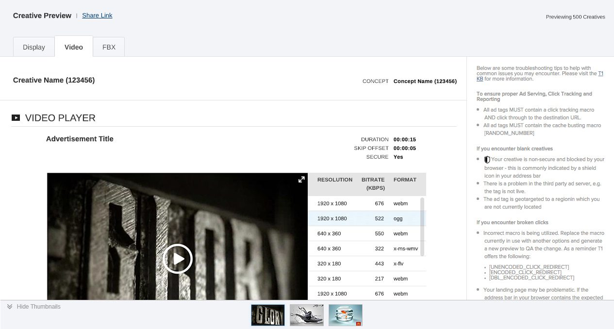
- Video preview showing 3rd Party ad served video concepts selected for preview
